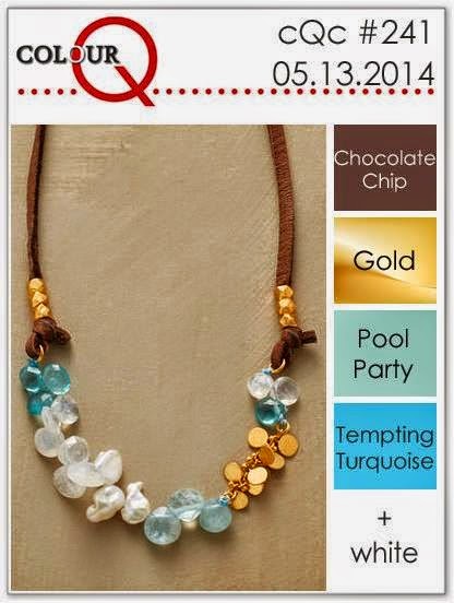
When you just don't think it is looking right, try something different. That's exactly what I did with this card. The first photo shows what the card initially looked like. Well, I didn't like it. The design, yes; the colors, yes; the plain look of it, nope! So, I jazzed it up just a wee bit as you can see in the second photo. I wanted to leave the sketch from
CAS(E) this Sketch Challenge pretty much as it was since I really liked the look of it. And, the colors from the
ColourQ Challenge look so good together.
 |
| The Before |
See what I mean? It's just a bit dull and you can't see the sentiment that I stamped using
Craft White as it just doesn't show up well at all on the
Tempting Turquoise. What to do! Now here is the finished project. I love that
Decorative Dots Embossing Folder!
 |
| The After |
Stamp Sets: Work of Art, Everything Eleanor (Stampin' Up!);
Ink: Pool Party (Stampin' Up!);
Card Stock: Chocolate Chip, Tempting Turquoise, Whisper White, Gold Foil Sheets (Stampin' Up!);
Accessories & Tools: Hexagon Punch, Owl Builder Punch, Itty Bitty Punch Pack Circle, Extra-Large Oval Punch, Decorative Dots Embossing Folder (Stampin' Up!), Dimensionals
In the second photo you can really see the gold of the hexagon. Overall, I like the revised card best. It has more character, wouldn't you agree?
For the
ColourQ Challenge, click
HERE.
You can find the sketch from
CAS(E) this Sketch HERE.
Thanks for stopping in at the
Coffee Pot Stamping Cafe,
Marsha


I like both of them but the embossing has definitely added a little something hasn't it? Cool take on both the challenges - thanks for playing along with Colour Q!
ReplyDeleteOh, how neat! Wonderful take on the sketch!
ReplyDeleteBoth look fabulous, Marsha! I do like the texture from the embossing though. :)
ReplyDelete